The first week of 2021 saw a three big global Brand Refresh campaigns.
General Motors launched a new logo after about 50 years, intending to convey its focus on electric vehicles.
Pfizer launched a new logo that conveys a shift from what is calls, “commerce to science”.
Burger King welcomed 2021 with a vibrant, new brand identity; the logo almost going back to its pre-1999 graphic version.
GM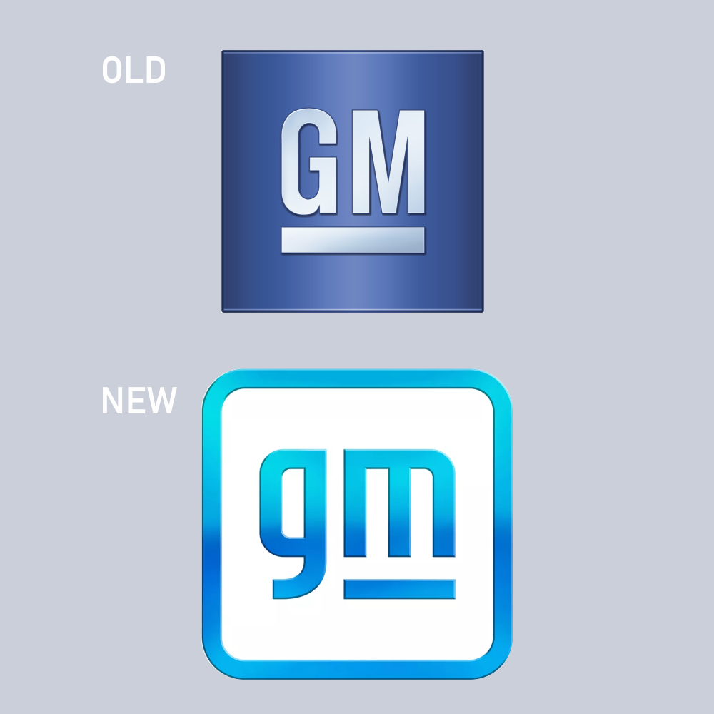
General Motors launched a new logo after about 50 years, intending to convey its focus on electric vehicles.
G and M in lowercase intend to projects a modern and contemporary appeal with the negative space in the arches of M giving the impression of an electric plug.
Some branding experts feel that this is a knee-jerk reaction to Tesla’s moves and that stability, legacy and trust are more valued propositions in current times than a modern appeal.
Designed by: General Motors’ in-house Team.
PFIZER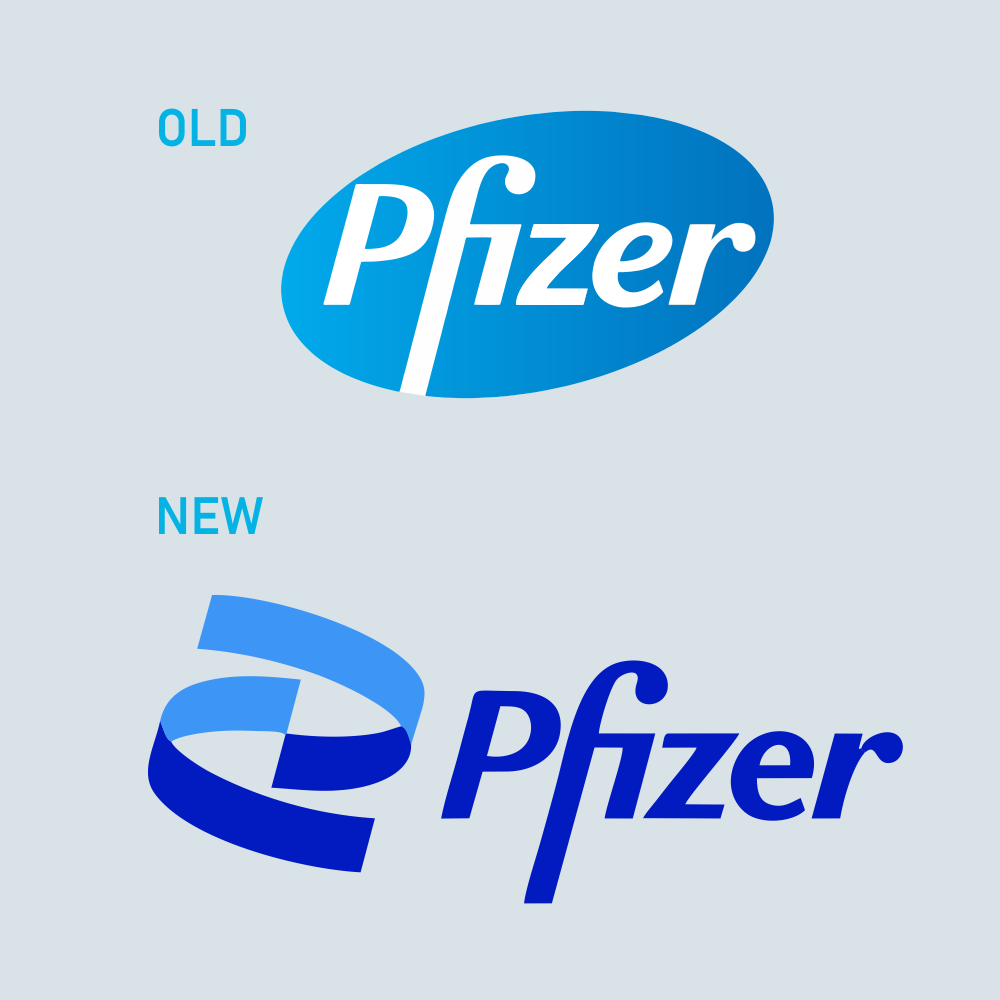
World’s most talked about company in recent times launched not only the most awaited vaccine but also a new logo that conveys a shift from what is calls, “commerce to science”.
An upward spiralling double helix replaces the blue tablet emphasising Pfizer’s deeper commitment to “breakthroughs”.
I personally find the blue deep blue very awkward and old-fashioned.
Designed by: Team, a Brooklyn-based studio
BURGER KING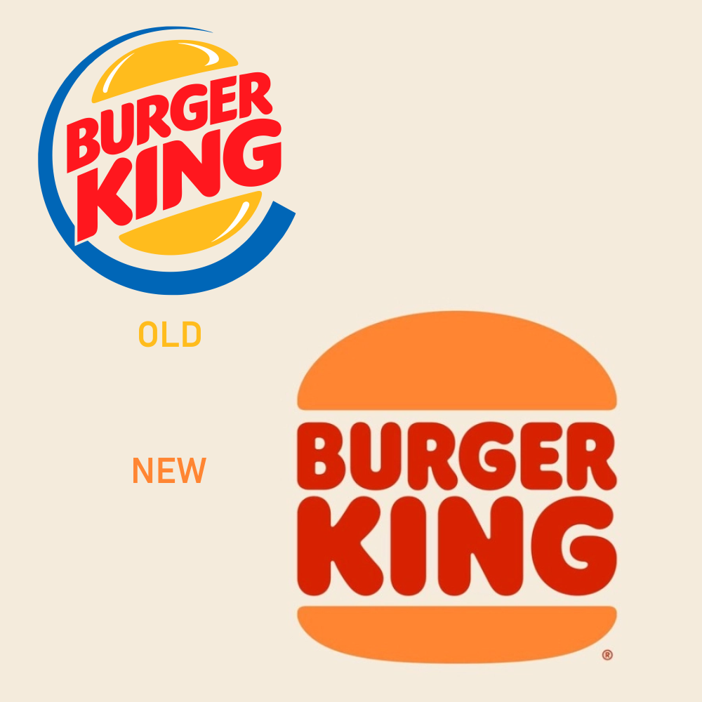
Burger King welcomed 2021 with a vibrant, new logo and brand identity; the logo almost going back to its pre-1999 graphic version.
It features simple, flat graphics, a custom semi-serif typeface called Flame and retro colours like burnt orange and mustard (far away from the synthetic blue in the older version). The new identity gives BK a very distinct look in the category..
Designed by: Jones Knowels Ritchie